One of the perils of being a librarian who was raised by a librarian that happened to work in a museum is that you can never just visit a museum. I always end up assessing things for the how and why behind the exhibit curation. It's a professional hazard.
On my trip to St. Louis, I made time to visit the Gateway Arch. My plan was to take the tram to go up to the top, snap a few pictures, and then head back down for a walk around the park. I did not know, until I arrived, that the Arch comes with an underground museum about the history of St. Louis and the westward expansion movement. After my trip to the top, I headed back to the museum to take a look at things.
Now, kudos to the curators. They packed in a lot of material in a relatively small space. There was a great mix of adult and kid content with plenty of interactive portions. My main quibble with the content was, as with most museums, the exhibit glazed over the sheer cruelty of westward expansion to the Native American populations. I get that you don't want to scare people or have R-rated material, but we've got to be a bit more honest with our history. Aside from that, the material on display was great.
What I could not get over was the layout. The architects clearly designed the underground space to mimic the curves of the Arch. That's cool from a design stand point, but it's difficult to work with as a museum curator. The room layout forces a weird flow on the visitor. Instead of moving in a linear or clearly forward path, you had to loop back across the main hallway several times if you wanted to follow the timeline structure. This put you in the path of school groups and other tourists who were zooming through to get to their tram ride times. The curved design also meant the middle of the "circles" of each loop had to be filled with something. The curators wisely used these for their more interactive or installation style materials, but it meant they felt a touch separated from the main timeline of the rest of the exhibit.
I would bet money that the architects of the space never met with the curators and librarians who would need to work with it. That is not uncommon at all. In fact, we had to go through that with my own library. Aside from a few questions sent over email, we never got to have input on our new space. And, now, we have to live with the inherent design flaws.
These are the things most visitors never see. But, if you ever think, "Why they heck is that like that?" when you visit a museum or library, now you know why.
I finally, after several hundred pages, fell in to the story of House of Earth and Blood. Now, I can’t wait to see how the final pages wrap up. I knew Maas wouldn’t let me down! I’m mere chapters away from finishing this book, so I’m glad the second title in the series was ready for me at the library yesterday.
*Books shared here are affiliate links for Bookshop.org
"Every woman is the wrong woman." [The Atlantic - gift link]
Trying to get our kiddo to eat carrots and I mentioned they were good for her eyes. Husband said he heard that was World War II propaganda to cover for the development of radar. Clearly, I had to investigate that fascinating tidbit. [Smithsonian]
Traditional news needs to pivot how they use social. [Link in Bio]
The changing meaning of the amendments. [Up First]
The desk on the mountain full of stories. [Atlas Obscura]
Humans are designed for life on Earth, not space or Mars. [Short Wave]
During my solo nights at the hotel, I watched the entire fifth season of The West Wing. I love this show, but I think this is the weakest season. It seems like they solve a major global issue each episode. It's a bit much. But this is the season where Glenn Close guest stars and I love that episode. [Max]
One of the presentations I attended at the Library Marketing Conference was on short form video. If you want a new account to follow, add the LA Public Library to your list. Their work is fantastic. [@lapubliclibrary]
Travelling for a conference means eating a lot of meals out. While I was in St. Louis, I picked up dinner one night from Koibito Poke. I built my own tuna poke bowl with a few recommendations from the guy behind the counter. It was fantastic. I should have gone back for a second dinner. [Koibito Poke]
I don't like to leave my hotel room to get breakfast in the morning. I prefer to lounge a bit with my coffee. While this conference did provide a light breakfast each morning, you never know what you're going to get. Lately, I've been travelling with cinnamon almond butter breakfast biscuits in my suitcase. They are a great morning nibble and even better back-up snack to carry in my conference bag. [Nature Valley]
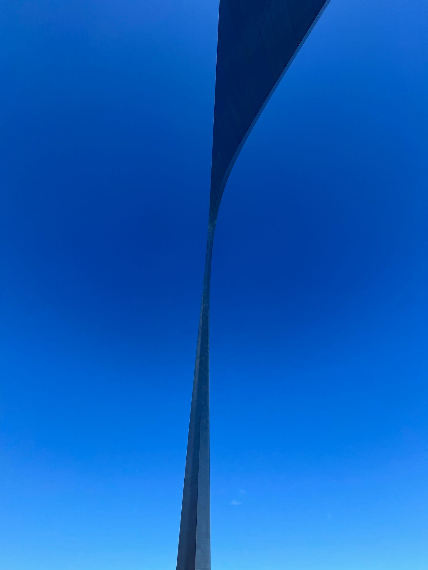
I thought the Gateway Arch was a beautiful piece of design. The shape of the Arch seemed to bend and change depending on where you were standing. I loved how thin and twisted it appeared overhead when you exited the museum.
Is cellar door the most beautiful phrase in the English language? Pick your favorite from various word pairs to help a team in the UK decide.
I have HUNDREDS of emails to get through after my week away from work. HUNDREDS!


